LAUNCH
NC State Studio
Team
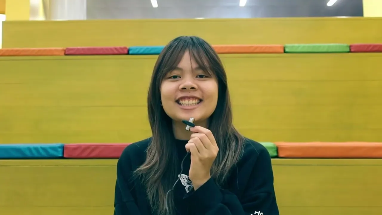
3 UX Designers
Year
2025
Duration
3 weeks
Overview
Located on NC State University's Centennial Campus, the Lake Raleigh Disc Golf Course is a hidden gem that many students don’t even know exists.
Our team rebranded the course as LAUNCH, creating a bold, cohesive identity and intuitive signage system that celebrates play, clarity, and the innovative spirit of Centennial Campus.
My Role
Visual Design: helped develop the overall brand creative direction, signage design, and visual language.
User Experience: assessed, ideated, tested, and executed course redesign deliverables.
Interface Design: designed the mobile app interface to reflect the established brand direction.
Video Editing: directed and edited promotional video
Background
What is Centennial Campus?
North Carolina State University is split into two campuses—the original Main campus, and Centennial Campus, built in 1984. Centennial is home to the engineering departments, corporate partners, as well as private residents. It is an intersection of research, innovation, and public-private partnership.
The land of Centennial Campus is also home to Lake Raleigh, and the Lake Raleigh Disc Golf course, which is open to students and the public. For this project, we partnered with the NC State Placemaking Center to redesign the disc golf experience.
Promotional Video
We asked students, staff, and residents of Centennial Campus one question: what makes you feel bold?
Having real conversations with the people who use Centennial Campus most, we were able to understand what makes it so meaningful. We used these answers to lead the creative direction of our campaign.
Our Solution
Rooted in Centennial’s identity as a hub of innovation, creativity, and unconventional thinking, LAUNCH represents both the motion of a disc and the start of bold new ideas.
A full wayfinding system, brand package, and mobile app to align the Lake Raleigh Disc Golf course with the bold and innovative spirit of Centennial Campus.

Research
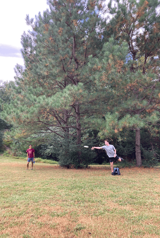
To better understand the course and its community, we played at the Lake Raleigh course, interviewed student players, visited nearby parks, and attended events on Centennial.
Initial Walkthrough


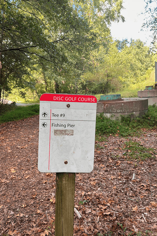


Minimal information, no visuals.
Poorly maintained and missing signs.
Poorly maintained and missing signs.
Lack of direction.
Unclear next steps.
Unclear next steps.
Student Interviews
The course has good bones, but lacks visibility and intentionality to make it a true community space.
To learn more about the real problems disc golfers have with this course, we played the course ourselves—with the help of some seasoned guides. Playing the course and learning about the history, culture, and significance of disc golf helped us understand who we were designing for.
“Weird designs, no upkeep, not worth it even if you're nearby.”

"Nice layout, but overgrown."
"Lots of trees makes identifying hole difficult for beginners, also higher risk of losing disc."
Lack of Visibility & Navigation
All interviewees struggled to find where to start and how to move between holes, disrupting the course experience.
Poor Maintence & Course Design
The course terrain was difficult to play in. Water and foliage obstacles were unmarked, creating unexpected suprises.
Opportunity for Social Experience
The course creates little opportunity for social interaction and lacks meeting areas, benches, and a unifying experience.
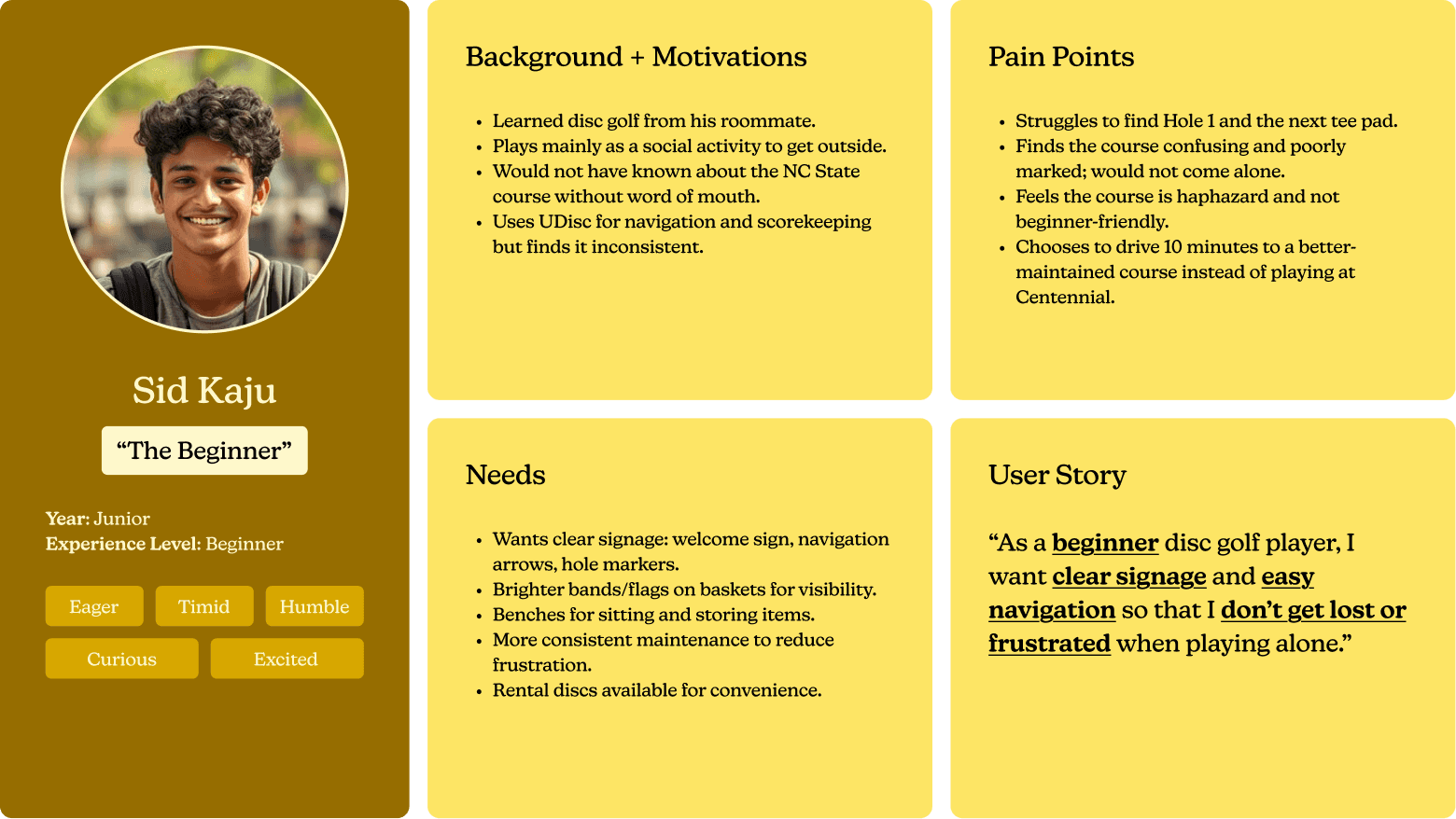
User Persona
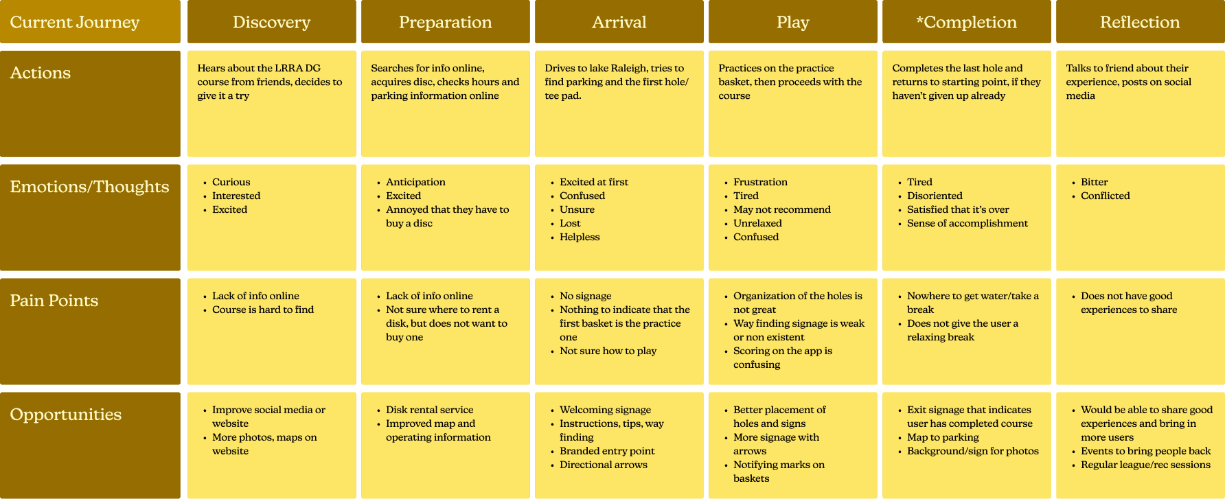
User Journey Map
Process
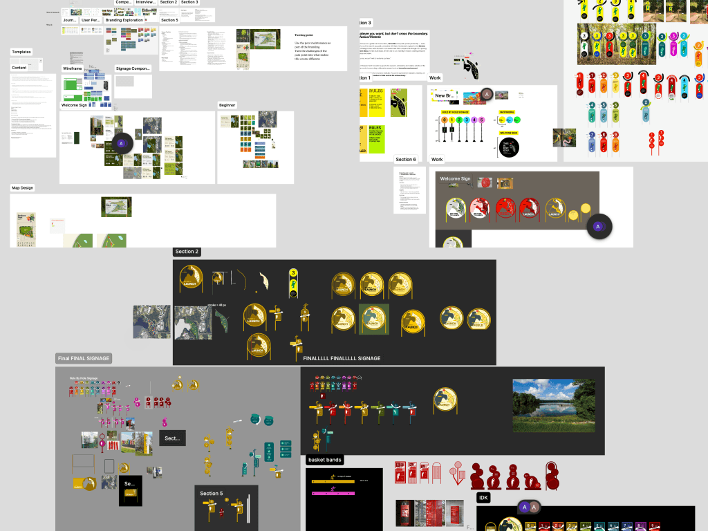
After several iterations, we realized that designing bold was more reflective of Centennial Campus' innovative spirit than designing within the brand guidelines.
Our first round of iterations was extremely safe. We stuck closely to the NC State brand guidelines and existing park designs. While the designs worked, they felt stale. After getting critique from a visiting designer, we were inspired to think bigger. Designing within a brand didn't mean we couldn't be innovative. We channeled what Centennial Campus is about at its core, rather than what is already is — innovation.

Too safe
Too safe

Weak identity, not intuitive
Weak identity, not intuitive
Lacks stability and consistency
Lacks stability and consistency
Final Design
Bold. Creative. Innovative.
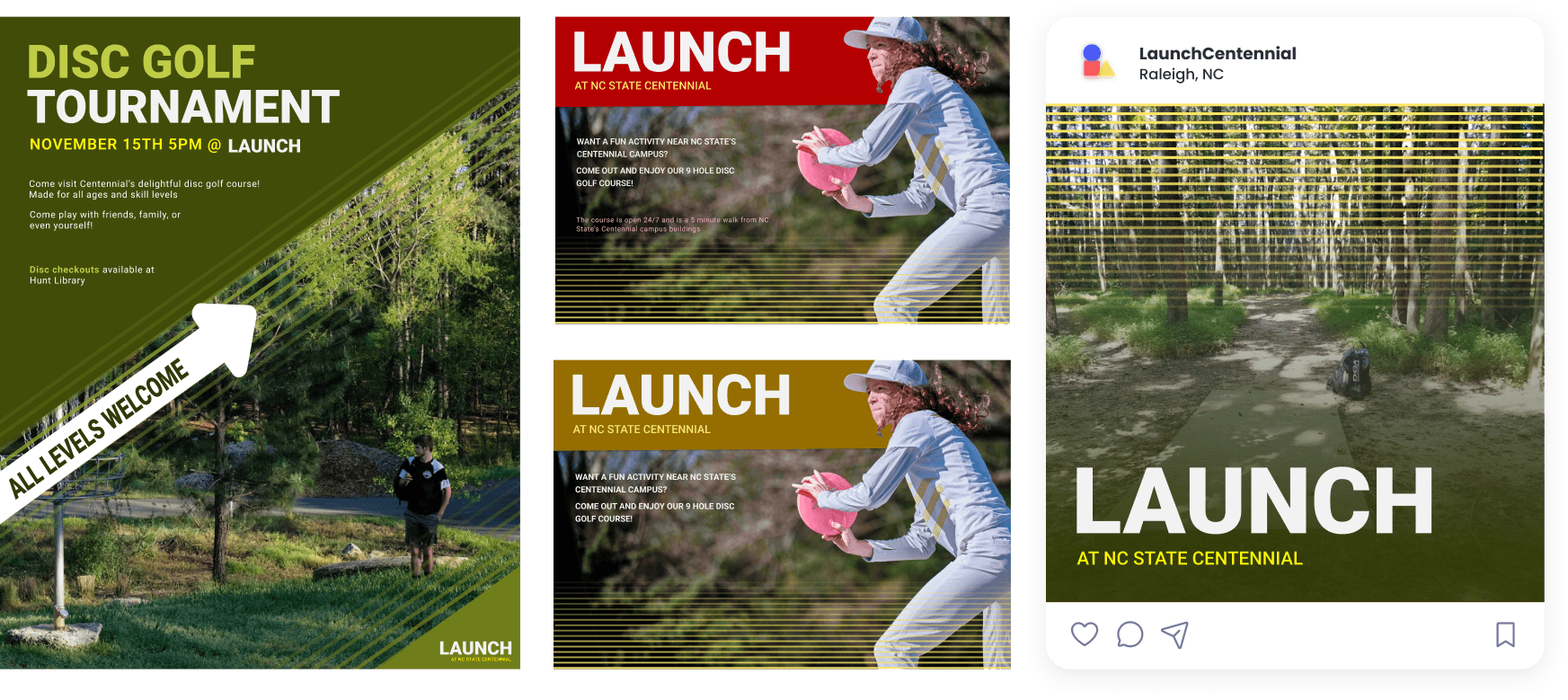
Rooted in Centennial’s identity as a hub of innovation, creativity, and unconventional thinking, LAUNCH represents both the motion of a disc and the start of bold new ideas.
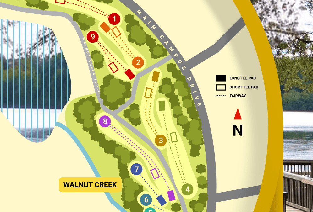
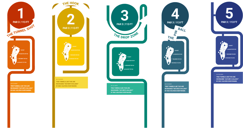
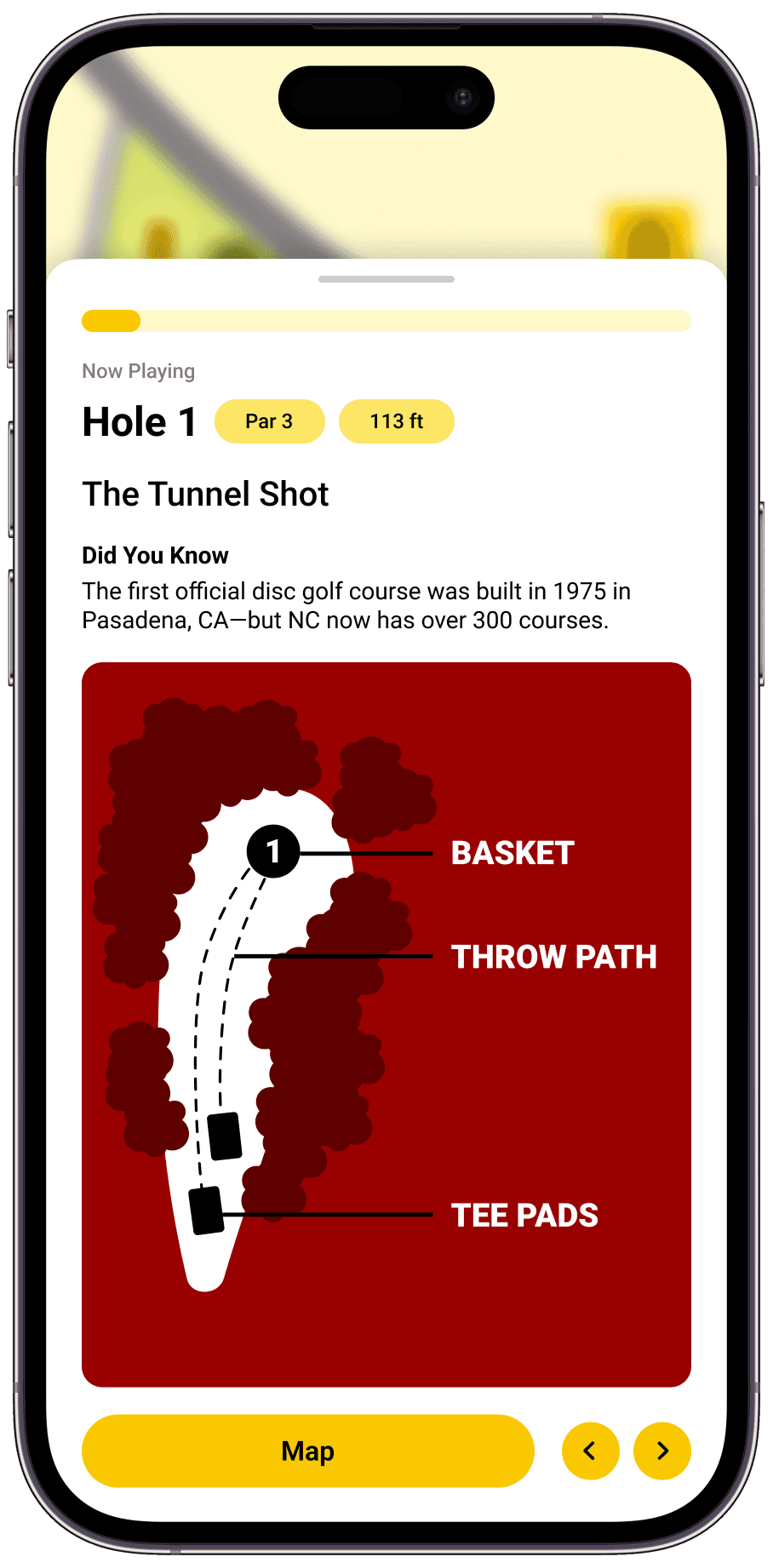
Wayfinding
Main welcome and informational signs resemble circular discs, while linear hole-by-hole signs guide users throughout the course.
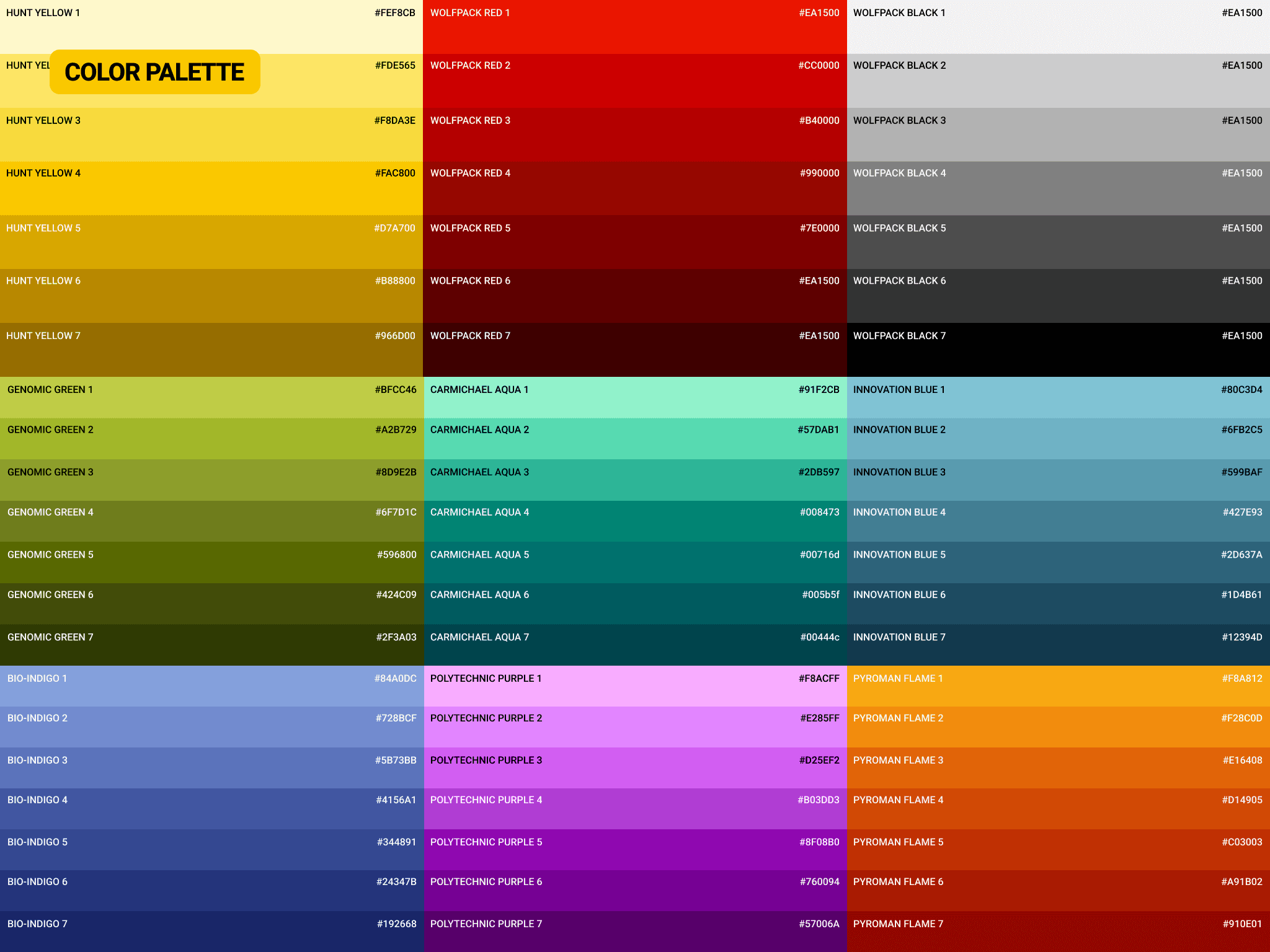
Our expanded color palette now includes Polytechnic Purple, an expansion of NC State's original eight-color kit, bringing an eccentric touch while remaining on brand. We use the NC State classic Roboto typeface in an all caps modification to emphasize the boldness of our brand.
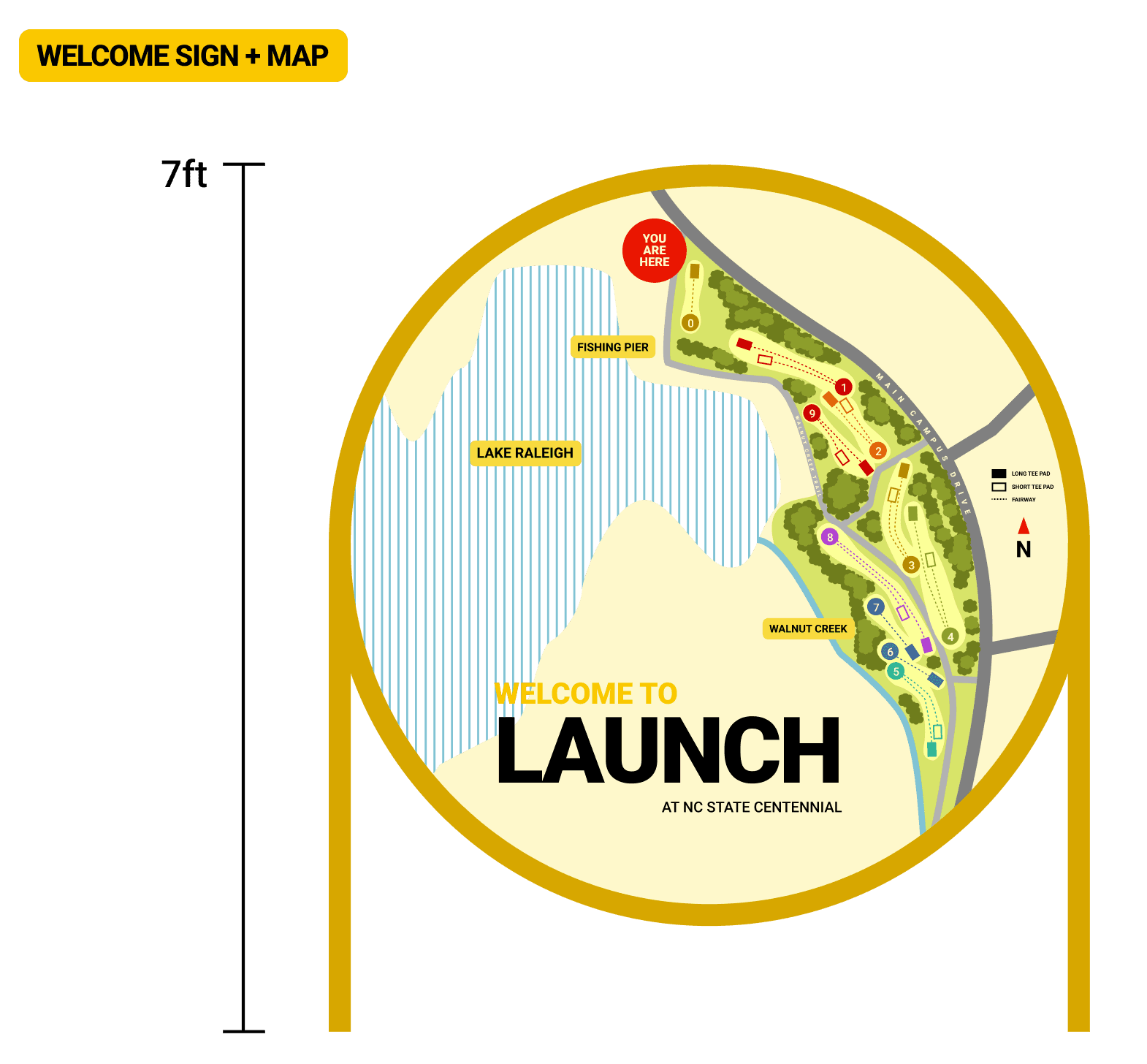
A color coordinated welcome sign gives players a reference point for course navigation.
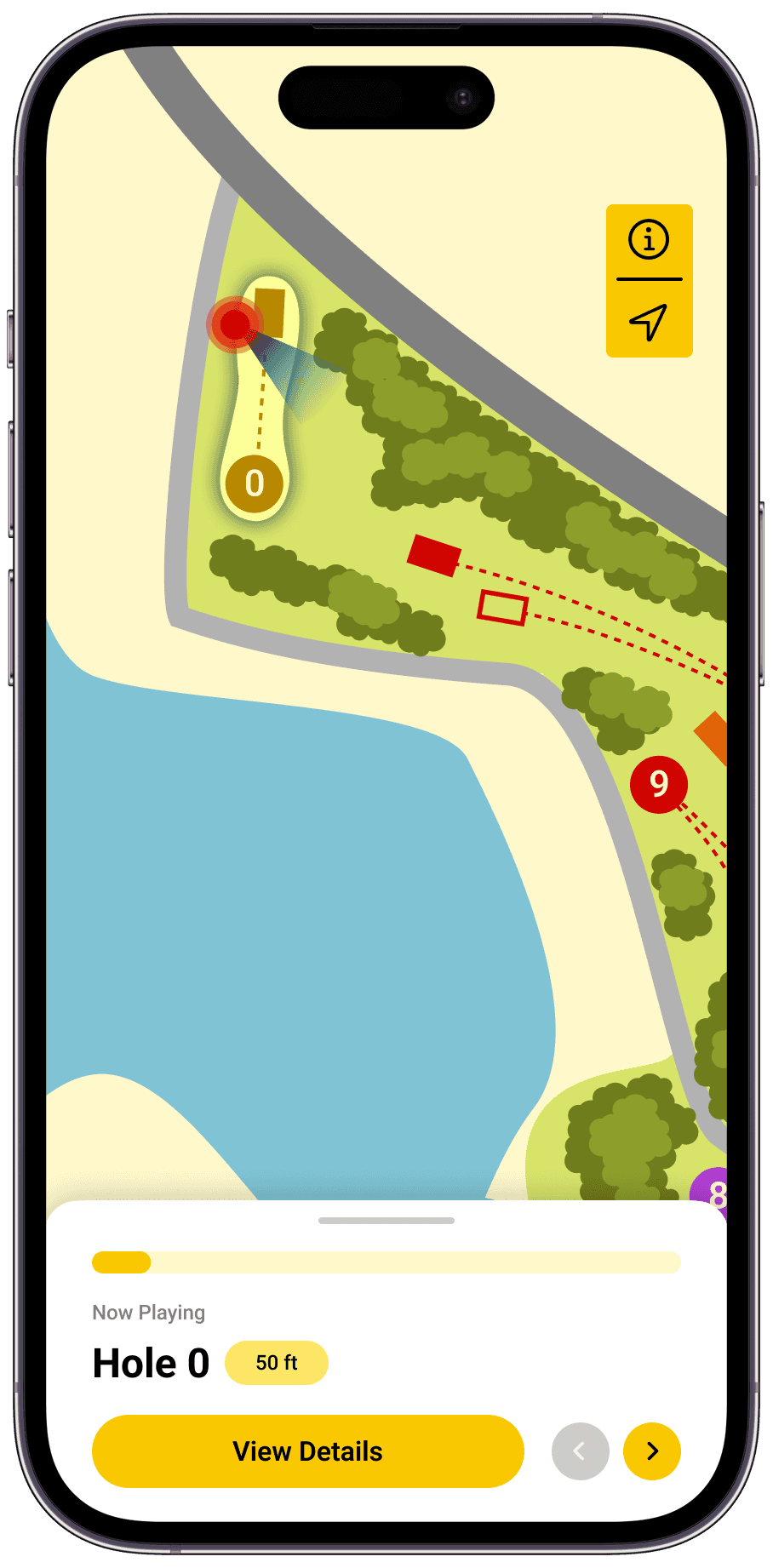
Each hole has a short tee pad and a long tee pad, indicated by the filled and unfilled rectangles. Surrounding foliage and landmarks are properly labeled.
The shape of Lake Raleigh is carved out, connecting the course brand with its natural environment.
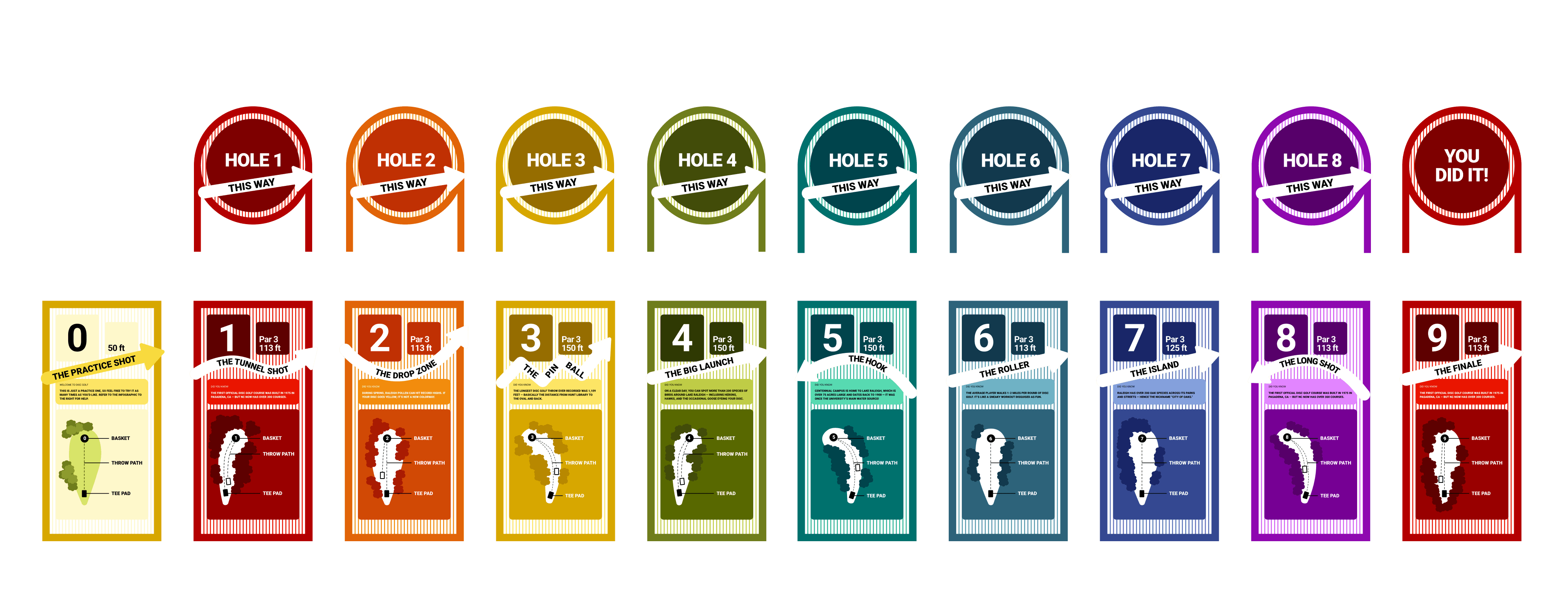
Clarity and information at each hole keeps players engaged and reassured.
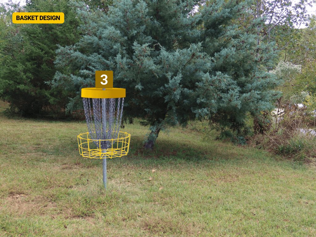
Each of the nine holes are marked with an individual sign indicating the par, distance, trajectory, and a historical fact. A white arrow at each hole turns natural obstacles and overgrown foliage into a course obstacle. At the end of each basket, a smaller circular sign directs players to the next hole.


Brand Design
Expanded brand kit honors NC State roots while pushing the boundaries.
Our expanded color palette now includes Polytechnic Purple, an expansion of NC State's original eight-color kit, bringing an eccentric touch while remaining on brand. We use the NC State classic Roboto typeface in an all caps modification to emphasize the boldness of our brand.

Continuity across physical and digital touch points creates cohesion and community.
Mobile Application
Everything you need, in the palm of your hand.
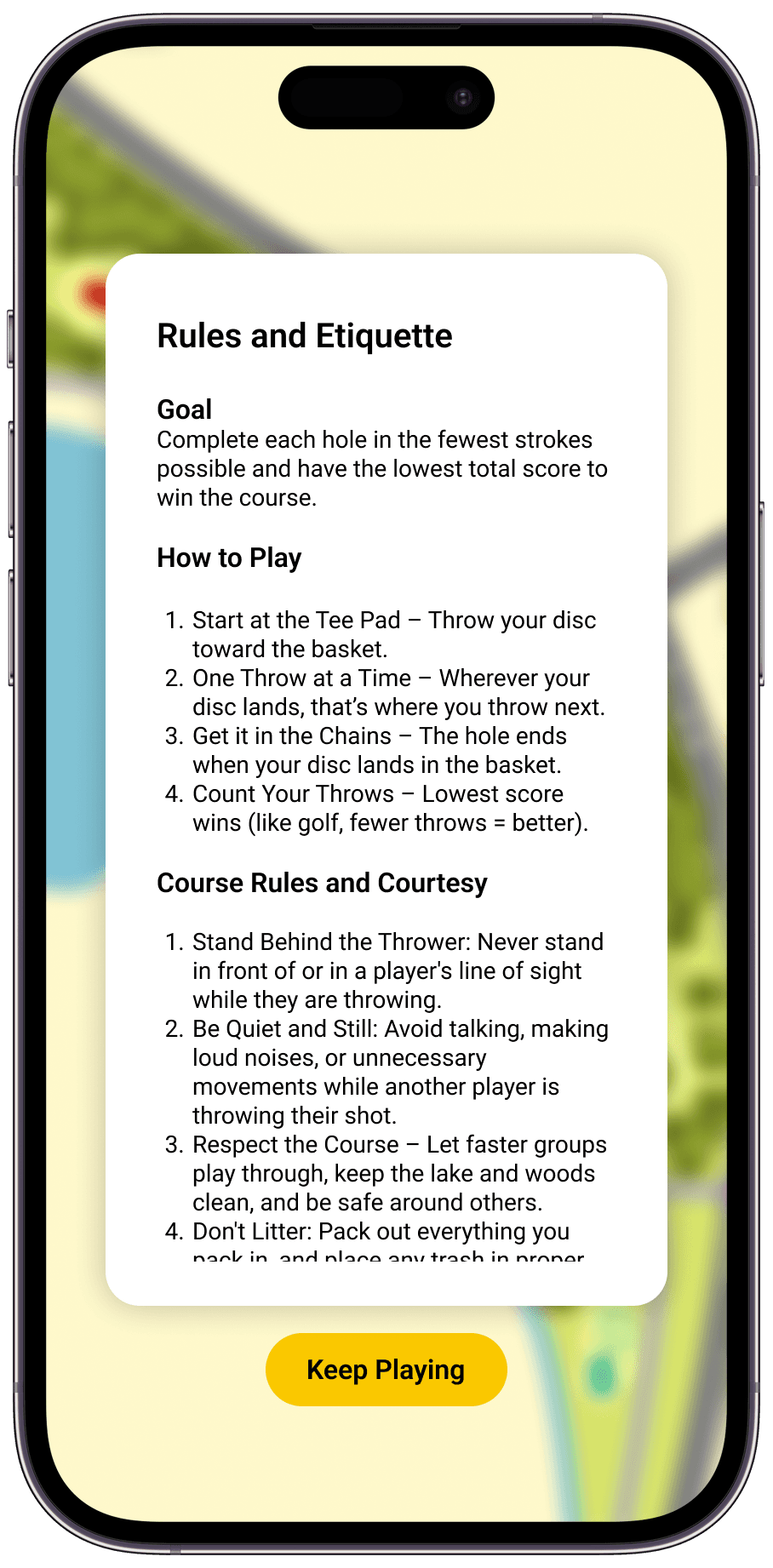
All navigation, game rules and etiquette, and course information is packaged into a mobile application that players can bring with them as they go through the course.
Reflection
Iteration iteration iteration.
Don't be afraid to start from scratch is something isn't working. Try everything that doesn't work in order to find what does.
Everything is problem solving.
While this wasn't a traditional UX project, the same principles apply. UX isn't about designing apps—its problem solving, understanding what isn't working for your user and how design can fix their problems.
Thanks for stopping by…
but don't leave yet! There is more to see.


Thanks for stopping by…
but don't leave yet! There is more to see.
LAUNCH
NC State Studio
Team
3 UX Designers
Year
2025
Duration
3 weeks
Overview
Located on NC State University's Centennial Campus, the Lake Raleigh Disc Golf Course is a hidden gem that many students don’t even know exists.
Our team rebranded the course as LAUNCH, creating a bold, cohesive identity and intuitive signage system that celebrates play, clarity, and the innovative spirit of Centennial Campus.
My Role
Visual Design: helped develop the overall brand creative direction, signage design, and visual language.
User Experience: assessed, ideated, tested, and executed course redesign deliverables.
Interface Design: designed the mobile app interface to reflect the established brand direction.
Video Editing: directed and edited promotional video
Background
What is Centennial Campus?
North Carolina State University is split into two campuses—the original Main campus, and Centennial Campus, built in 1984. Centennial is home to the engineering departments, corporate partners, as well as private residents. It is an intersection of research, innovation, and public-private partnership.
The land of Centennial Campus is also home to Lake Raleigh, and the Lake Raleigh Disc Golf course, which is open to students and the public. For this project, we partnered with the NC State Placemaking Center to redesign the disc golf experience.
Promotional Video
We asked students, staff, and residents of Centennial Campus one question: what makes you feel bold?
Having real conversations with the people who use Centennial Campus most, we were able to understand what makes it so meaningful. We used these answers to lead the creative direction of our campaign.
Our Solution
Rooted in Centennial’s identity as a hub of innovation, creativity, and unconventional thinking, LAUNCH represents both the motion of a disc and the start of bold new ideas.
A full wayfinding system, brand package, and mobile app to align the Lake Raleigh Disc Golf course with the bold and innovative spirit of Centennial Campus.
Research
To better understand the course and its community, we played at the Lake Raleigh course, interviewed student players, visited nearby parks, and attended events on Centennial.
Initial Walkthrough
Minimal information, no visuals.
Poorly maintained and missing signs.
Lack of direction.
Unclear next steps.
Student Interviews
The course has good bones, but lacks visibility and intentionality to make it a true community space.
To learn more about the real problems disc golfers have with this course, we played the course ourselves—with the help of some seasoned guides. Playing the course and learning about the history, culture, and significance of disc golf helped us understand who we were designing for.
“Weird designs, no upkeep, not worth it even if you're nearby.”
"Nice layout, but overgrown."
"Lots of trees makes identifying hole difficult for beginners, also higher risk of losing disc."
Lack of Visibility & Navigation
All interviewees struggled to find where to start and how to move between holes, disrupting the course experience.
Poor Maintence & Course Design
The course terrain was difficult to play in. Water and foliage obstacles were unmarked, creating unexpected suprises.
Opportunity for Social Experience
The course creates little opportunity for social interaction and lacks meeting areas, benches, and a unifying experience.
User Persona
User Journey Map
Process
After several iterations, we realized that designing bold was more reflective of Centennial Campus' innovative spirit than designing within the brand guidelines.
Our first round of iterations was extremely safe. We stuck closely to the NC State brand guidelines and existing park designs. While the designs worked, they felt stale. After getting critique from a visiting designer, we were inspired to think bigger. Designing within a brand didn't mean we couldn't be innovative. We channeled what Centennial Campus is about at its core, rather than what is already is — innovation.
Too safe
Weak identity, not intuitive
Lacks stability and consistency
Final Design
Bold. Creative. Innovative.
Rooted in Centennial’s identity as a hub of innovation, creativity, and unconventional thinking, LAUNCH represents both the motion of a disc and the start of bold new ideas.
Wayfinding
Main welcome and informational signs resemble circular discs, while linear hole-by-hole signs guide users throughout the course.
Our expanded color palette now includes Polytechnic Purple, an expansion of NC State's original eight-color kit, bringing an eccentric touch while remaining on brand. We use the NC State classic Roboto typeface in an all caps modification to emphasize the boldness of our brand.
A color coordinated welcome sign gives players a reference point for course navigation.
Each hole has a short tee pad and a long tee pad, indicated by the filled and unfilled rectangles. Surrounding foliage and landmarks are properly labeled.
The shape of Lake Raleigh is carved out, connecting the course brand with its natural environment.
Clarity and information at each hole keeps players engaged and reassured.
Each of the nine holes are marked with an individual sign indicating the par, distance, trajectory, and a historical fact. A white arrow at each hole turns natural obstacles and overgrown foliage into a course obstacle. At the end of each basket, a smaller circular sign directs players to the next hole.
Brand Design
Expanded brand kit honors NC State roots while pushing the boundaries.
Our expanded color palette now includes Polytechnic Purple, an expansion of NC State's original eight-color kit, bringing an eccentric touch while remaining on brand. We use the NC State classic Roboto typeface in an all caps modification to emphasize the boldness of our brand.
Continuity across physical and digital touch points creates cohesion and community.
Mobile Application
Everything you need, in the palm of your hand.
All navigation, game rules and etiquette, and course information is packaged into a mobile application that players can bring with them as they go through the course.
Reflection
Iteration iteration iteration.
Don't be afraid to start from scratch is something isn't working. Try everything that doesn't work in order to find what does.
Everything is problem solving.
While this wasn't a traditional UX project, the same principles apply. UX isn't about designing apps—its problem solving, understanding what isn't working for your user and how design can fix their problems.